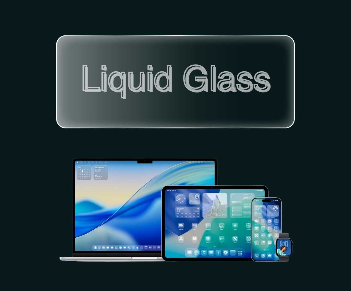
Apple’s introduction of Liquid Glass in iOS 26 marks the most significant visual transformation since the dramatic shift from skeuomorphism to flat design in iOS 7. Yet as designers examine this new interface language, many find themselves experiencing déjà vu, the translucent, glossy aesthetic bears striking resemblance to Windows Vista’s Aero design from 2006, raising fascinating questions about cyclical design trends and the persistent allure of glass-like interfaces.
The DNA of Digital Glass
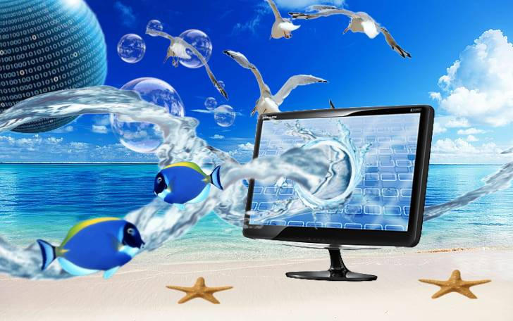
Liquid Glass didn’t emerge in a vacuum. To understand its significance, we must examine its design heritage, which traces back to the mid-2000s aesthetic movement known as Frutiger Aero. This design language, prevalent from 2004 to 2013, emphasized glossy textures, translucent elements, and skeuomorphic details that made digital interfaces feel more tactile and familiar. Windows Vista’s Aero interface, with its transparent window borders and frosted glass effects, became the most recognizable manifestation of this aesthetic.
The Frutiger Aero movement represented a fascinating paradox: it combined futuristic visual elements with natural imagery, creating interfaces that promised “a utopia where efficiency and the environment coexist”. This optimistic vision of technology harmonizing with nature influenced everything from operating systems to advertising campaigns, establishing glass and transparency as symbols of sophistication and progress.
The Cyclical Nature of Design Trends
Apple’s design evolution has always reflected broader cultural shifts. The company’s original embrace of skeuomorphism made perfect sense when touchscreens were new and users needed visual cues to understand how to interact with glass surfaces. Steve Jobs famously believed that “since the iPhone screen had no buttons and no real tactile quality, it would be helpful to suggest to the user what was a button and what wasn’t”.
However, by 2013, users had become comfortable with touch interfaces, leading to iOS 7’s dramatic shift toward flat design. Jonathan Ive explained this transition: “We understood that people had already become comfortable with touching glass, they didn’t need physical buttons, they understood the benefits… So there was an incredible liberty in not having to reference the physical world so literally”.
Now, twelve years after iOS 7’s flat revolution, Apple has come full circle with Liquid Glass. This return to transparency and visual richness suggests that design trends are indeed cyclical, with each generation rediscovering and reinterpreting previous aesthetics.
Technical Ambitions and Visual Complexity
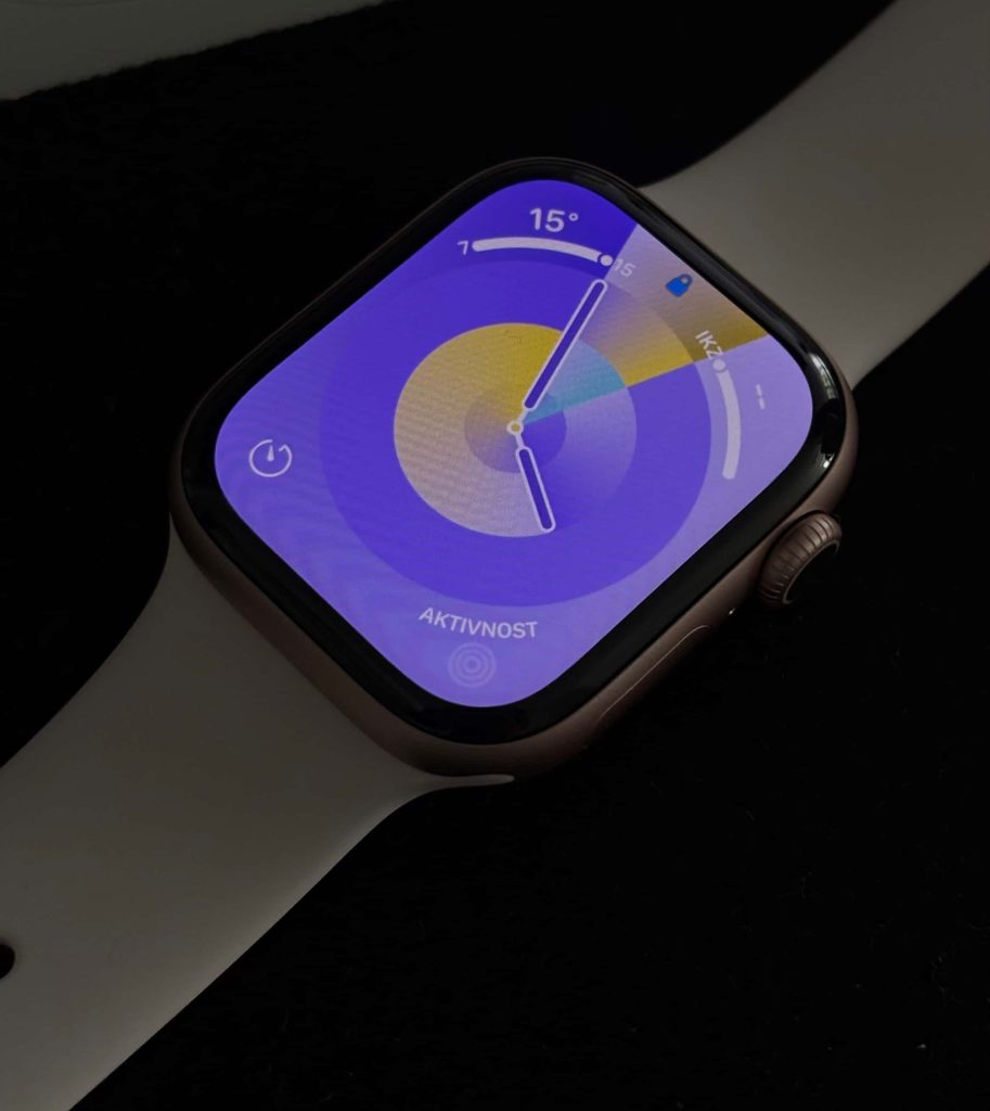
From a technical perspective, Liquid Glass represents a remarkable achievement. The interface uses real-time blur effects, dynamic transparency adjustments, and physics-based animations that respond to device movement and user interaction. The system creates depth through layered translucency while maintaining visual hierarchy, a challenging balance that requires sophisticated rendering capabilities.
The engineering implications are staggering, as one analysis noted: “Apple has essentially created a physics engine for interface elements that runs constantly without draining battery, and it still keeps performance smooth across the hardware lineup”. This technical prowess enables effects that were impossible during the original glass interface era, potentially explaining why Apple feels confident revisiting this aesthetic approach.
The Vista Parallel: Lessons from History
The comparison to Windows Vista’s Aero is particularly illuminating. Vista’s glass interface was groundbreaking but suffered from significant performance issues on the hardware of its time. Many users lacked the graphics capabilities needed to run Aero smoothly, leading to widespread criticism and contributing to Vista’s troubled reputation.
However, Vista’s design influence extended far beyond its technical limitations. The Aero aesthetic represented “Microsoft’s first major interface redesign since Windows 95,” introducing transparency, blur effects, and three-dimensional window management that would influence interface design for years. Even today, elements of Aero’s design philosophy persist in modern operating systems, albeit refined and optimized.
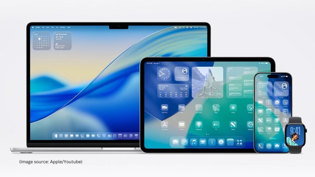
Apple appears to have learned from Vista’s mistakes. Unlike Microsoft’s broad implementation across all interface elements, Liquid Glass is more strategically applied, focusing on overlay components like tab bars, toolbars, and floating elements rather than permeating the entire interface. This restrained approach acknowledges that glass effects work best as accent elements rather than foundational design principles.
The Double-Edged Sword of Transparency
While Liquid Glass showcases impressive technical capabilities, its implementation raises significant usability concerns. Multiple design critics have highlighted fundamental problems with transparent interfaces, particularly regarding readability and visual hierarchy. The Nielsen Norman Group’s analysis was particularly damning, describing the interface as making “UI elements translucent and bubbly” resulting in content that is “light, airy, and often invisible”.
These accessibility concerns echo broader challenges with glassmorphism as a design trend. Research indicates that transparency effects can create “low contrast, background interference, and motion sensitivity” issues that particularly impact users with visual or cognitive disabilities. The trend toward transparent interfaces often prioritizes visual spectacle over functional clarity, creating what some critics describe as “spectacle over usability”.
A Designer’s Perspective on Functionality Versus Aesthetics
From a design standpoint, Liquid Glass represents a fundamental tension between visual innovation and user experience principles. The interface undeniably creates a sense of depth and visual richness that can enhance the perceived quality of interactions. The real-time response to device movement and the fluid morphing of interface elements create an engaging, almost magical user experience that aligns with Apple’s brand identity of seamless technology integration.
However, this visual sophistication comes at the cost of clarity and predictability. Traditional design principles emphasize the importance of clear visual hierarchies, high contrast ratios, and consistent interface patterns. Liquid Glass challenges these conventions by introducing elements that shift and change based on context, potentially creating cognitive load as users must continuously adapt to interface variations.
The customizable nature of Liquid Glass, where users can adjust transparency and viscosity levels through accessibility settings, presents both opportunities and challenges. While this personalization acknowledges that different users have different needs, it also means that designers can no longer assume a consistent visual baseline when creating applications.
Historical Context and Future Implications
The return to glass aesthetics occurs in a significantly different technological and cultural context than the original Frutiger Aero era. Today’s users are digital natives comfortable with complex interfaces, high-resolution displays can render subtle transparency effects with greater fidelity, and processing power can handle real-time visual effects that were previously impossible.
Yet this return also reflects a broader cultural nostalgia for the optimistic techno-utopianism of the mid-2000s. Social media platforms have seen renewed interest in Frutiger Aero aesthetics, with Generation Z users particularly drawn to imagery that depicts “the harmonious marriage between nature and technology”. This nostalgic revival suggests that Liquid Glass taps into deeper cultural desires for technology that feels more humane and approachable.
Accessibility: The Persistent Challenge
Despite Apple’s reputation as an accessibility leader, Liquid Glass raises significant concerns about inclusive design. Critics note that even with accessibility features like “Reduce Transparency” enabled, fundamental readability issues persist. The challenge isn’t simply that users can disable problematic effects, but whether the default experience should require accessibility accommodations for basic usability.
Research on glassmorphism consistently identifies contrast and readability as primary concerns. When interface elements blend with background content, users with visual impairments face additional challenges, but even users with perfect vision can struggle with transparent interfaces under certain lighting conditions or when using devices one-handed.
The accessibility implications extend beyond permanent disabilities. Transparent interfaces can be particularly problematic for users experiencing temporary impairments, using devices in bright sunlight, or dealing with cracked screens—situations that affect all users at various times.
The Broader Design Ecosystem Impact
Apple’s design decisions invariably influence the broader technology industry. The shift to flat design following iOS 7 was adopted across platforms, from Android’s Material Design to Windows’ Metro interface. Similarly, Liquid Glass is likely to spawn numerous imitations, though not all will have Apple’s technical resources or design expertise.
This influence creates particular concern among accessibility advocates who worry about poorly executed glass interfaces flooding the market. While Apple may refine Liquid Glass based on user feedback and accessibility requirements, third-party developers might implement similar aesthetics without proper consideration of usability implications.
Design Evolution or Revolution?
Liquid Glass represents evolution rather than revolution, a sophisticated refinement of aesthetic principles that have cycled through digital design for decades. The interface builds upon years of technical advancement and user familiarity with touch interfaces to create something that would have been impossible during the original glass interface era.
Yet this evolution also highlights persistent tensions in interface design between visual appeal and functional clarity. The return to glass aesthetics suggests that users crave visual richness and depth, even when it potentially compromises usability. This tension reflects broader questions about the role of aesthetics in functional design and whether beautiful interfaces can justify usability trade-offs.
Looking Forward: Lessons from the Past
As iOS 26 and Liquid Glass reach wider audiences, the design community will undoubtedly learn valuable lessons about implementing transparency effects at scale. Apple’s iterative approach, refining the interface through beta testing and developer feedback, suggests awareness of potential issues and willingness to adjust the design based on real-world usage.
The historical parallel with Windows Vista offers both caution and hope. While Vista’s glass interface faced criticism for performance and usability issues, its design influence proved lasting and valuable. Similarly, Liquid Glass may face initial skepticism but could establish new patterns for sophisticated interface design that balance visual appeal with functional requirements.
The ultimate success of Liquid Glass will depend not on its technical impressiveness or visual appeal, but on whether it enhances or hinders users’ ability to accomplish their goals. In this regard, the interface represents both the promise and peril of design innovation, the potential to create more engaging, beautiful experiences alongside the risk of prioritizing form over function.
As designers, our task is to learn from both the successes and failures of glass interfaces past and present, creating designs that honor both aesthetic ambition and user needs. The glass may be liquid, but good design principles remain solid.